Senior Brand + Creative Director
Ours to Tell
Creative Problem
Even before Roe v. Wade fell, abortion access across the U.S. had been under sustained attack for over a decade — with an unprecedented wave of state restrictions disproportionately impacting people of color and low-income communities. This despite broad public support for reproductive healthcare and the fact that 1 in 4 women of reproductive age have had an abortion.
Creative Solution
Ours to Tell was a Planned Parenthood content series that brought real patients and providers forward to share their stories — destigmatizing abortion through illustrated graphics, animation, Instagram stories, and short and long-form video. The work extended a short film of the same name created with We Testify, expanding its reach and emotional impact across platforms.
Role: As Senior Creative Director and Strategist I led this campaign concept, story, and execution across the full series.
Senior Creative Director and Strategist: Elizabeth Bawol
Creative Director: Ande Hubbard
Assoc. Creative Director: Ali Bibbo
Video Direction: Anayamel Rodriguez
Brand Strategy: Perry Meyers
Production Support: Windy Films
Illustration: Eugenia Mello
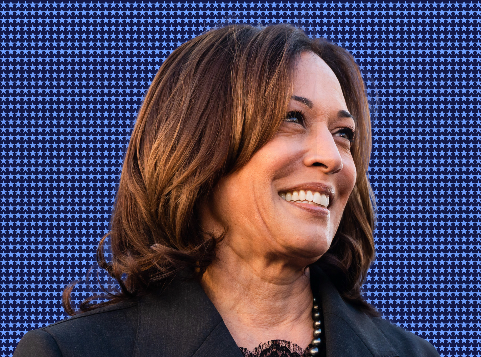
Harris for President
Creative Problem:
Upon Vice President Harris's nomination, a powerful brand was urgently needed to reintroduce her to the American public — one that reflected her charisma, expertise, candor, and historic identity as the country's first Black and South Asian female presidential nominee. With 107 days until Election Day, the stakes and the sprint were immense.
Creative Solution
Harris/Walz for President needed a brand that was simple, inspiring, and hopeful. It needed to strike an emotional chord with the American public. Our concept, This Is Our America, centered a vision of inclusive, joyful possibility — owned by the voters themselves. The work nodded to a legacy of Democratic trailblazers including Shirley Chisholm, Hillary Clinton, and JFK, and drew from historic movements for civil rights, racial justice, and feminism. Intentional typographic choices — including foregrounding Harris's last name, a respect routinely afforded male candidates — shaped a system of meaning and dignity. The brand was expressed across a 150-page brand book and executed across the full campaign identity. While the outcome was not what we hoped, the passion and craft behind this work remains something our team is deeply proud of.
Role: I creative directed our strategy, vision, brand identity, and system design in close partnership with the team at Wide Eye and in close collaboration with the Harris for President creative, communications, and political leadership.
While the outcome of that election was devastating for so many of us. I’ll always be proud to have been one of the 74,938,535 people who voted for the Harris/Walz vision for America and supported her campaign.
Wide Eye Brand Project Team:
Wide Eye Founder & ECD: Ben Ostrower
Creative Director / Strategist: Elizabeth Bawol
Associate Creative Director: Alayna Citrin
Art Director: Grace Abe
Senior Designer: Sebastian Arrendando
Designer: Matt Vogel
Director of Project Management/Account: Kayla Holbeck
With gratitude for the full Harris for President team and in particular, Creative Director: Kate Conway & Assoc. Creative Director: Shar Biggers for their collaboration, as well as the collaboration of type studios, Type Supply, Peregrin Studio (peregrinstudio.com), Lift Type (lift-type.fr) and Vocal Type for all the exploring along the way. (And, fast.)
+++ The vast number of creatives, vendors, and producers I didn't know, who worked night and day for 107 days leading up to the election.
This is Health Care
Creative Problem:
Even as attacks on women, reproductive health care, abortion access, and the LGBTQ+ community increased year over year, many patients who could benefit from Planned Parenthood's affordable care lacked a full understanding of the scale and scope of services available to them. The politicizing of health care created noise and distraction from the basic care people across the country needed and wanted.
Creative Solution:
This is Health Care was a patient-focused marketing campaign inviting people to visit Planned Parenthood health centers and receive high-quality, inclusive care. Built around a simple truth — that sexual and reproductive health care is a critically important part of overall health, and access to it a basic human right — the campaign featured real stories of everyday people who sought care at Planned Parenthood or faced barriers to it. The result was an authentic, varied content effort to combat stigma, elevated by an inclusive and inviting message for patients. The campaign ran nationally in English and Spanish, spanning out-of-home, radio, digital paid video, social media, and a custom photo shoot featuring a diverse group of Planned Parenthood patient advocates.
Role As Senior Creative Director, I conceived and led this campaign with our internal creative team and an external team of supportive production and video companies.
Awarded 2021 Telly Award — Silver, Diversity & Inclusivity | 2021 Telly Award — Silver, Branded Content
Executive Creative Direction: Elizabeth Bawol
Art Direction: Ande Hubbard
Video Direction: Anayamel Rodriguez & Rachel Velasquez
Design: Annie Pearlman
Brand Strategy: Lauren Garcimonde-Fisher
Production Support: Culture House & Windy Films
Unstoppable
Creative Challenge:
“One of us can be dismissed. Two of us can be ignored. But, together, we are a movement and we are Unstoppable.”
—Cecile Richards, Abortion Activist, Author
Creative Problem:
Prior to the fall of Roe, and in the wake of the #MeToo and #TimesUp movements, Planned Parenthood recognized a critical intersectional moment for human rights, bodily autonomy, and gender equity — one that called for more than a traditional advocacy campaign.
Creative Solution:
Unstoppable was an advocacy campaign with an artistic twist, launched around the anniversary of the Women's March in Washington, D.C. Powered by Planned Parenthood and joined by a wide range of diverse artists, partners, and activists, the campaign created a moment for art, design, and film to elevate the power of unity, collaboration, and the fight for bodily autonomy. In partnership with artist, activist, and filmmaker Tanya Selvaratnam, a collective of artists from across the country contributed work exploring themes of freedom, unity, and self-determination. The campaign included a manifesto film set to MILCK's viral anthem "Quiet," short documentary films, visual art, motion design, social media, and a dedicated website designed by Firebelly Design in Chicago.
Role: I conceived this campaign, and partnered with artist/video producer, Tanya Selveratnam to assemble this artist collective as Executive Producer of all art and video content and Executive Creative Director for the Campaign.
Awarded 2019 Webby Award — Activism & Design | 2019 Brand Film Award — Best Mini-Documentary Series for Good
© Planned Parenthood Federation of America 2019
Unstoppable Manifesto Video: Created for Planned Parenthood Action Fund and set to the music of the viral anthem ‘Quiet’ by MILCK, UNSTOPPABLE commemorates the one-year anniversary of the Women’s March and highlights the ways in which women are shaping public consciousness towards progress.
Featured here:
“My Body is My Own” created with Cynthia Hill
“Everyday, I” by Alexa Lim Haas
“I Told Them” Stephanie Wang-Breal
Other work featured as a part of Unstoppable included visual art by Zoe Buckman, Rachel Aliza Griffiths, Naomi Alderman and many other talented contributors. Many can be seen in this collection.
Project Team:
Executive Creative Director/Producer: Elizabeth Bawol
Executive Video Producers: Tanya Selveratnam, Julie Zuckerbrod, Lauren Garcimonde-Fisher, Ellen Weissfeld
Senior Editorial Direction: Ylonda Gault
Chief Brand Officer: Dawn Laguens
Creative / Artist Partner: Tanya Selveratnam
Interactive design: Firebelly Creative
Produced: Naming, Branding, Brand Identity, Web Design, Social Media, Video, Motion Design, Campaign Collateral
Center for Reproductive Rights
Creative Problem:
Since 1992, the Center for Reproductive Rights has used the power of law to advance reproductive rights as fundamental human rights around the world. Over time, their brand and visual system had grown outdated, cold, and overwhelming—failing to reflect the urgency and humanity of their mission or the breadth of their global impact.
Creative Solution:
My team and I built a refreshed modern visual system and comprehensive digital platform, moving away from staid legal aesthetics toward a bold, human-centric brand experience. A vibrant new visual identity introduced an expanded color palette and an emotionally resonant approach to photography connecting audiences across five continents. Custom illustrations brought complex issues to life and told the stories of people behind global cases. A dynamic new web experience precisely balanced the Center's legal authority with human storytelling — featuring interactive tools like custom global maps, clear pathways to engage, and showcased victories designed to inspire hope and action.
Role:
As Creative Director, I led brand strategy, visual identity, and brand design—guiding the organization from a cold legal aesthetic to a modern, human, movement-worthy brand presence.
Design Leads (UI + Brand): Alex Rosales / Grace Abe
Illustrations: Elizabeth Bawol + Hyewon Lee
SNAP
Creative Challenge:
Wide Eye established a creative partnership with Snap in 2022 to develop and support ongoing marketing and communication efforts to parents and teens about online safety. With online threats growing worldwide and teen mental health top of mind for many parents across the globe, many social media company’s efforts towards teen safety was largely performative and ineffective. At Snapchat, the founder made a commitment to creating a space where family and friends could connect, and teens and their parents could control their experience through education efforts, reminders of privacy settings, a custom family center where adults could keep teens safe without compromising their privacy.
Creative Opportunity:
For two years, I led a creative team that developed ads, animations, static graphics, microsites, and videos, building their brand identity as a partner to families and teens in protecting their online experience.
Throughout this collaboration, our team—comprising designers, strategists, directors, writers, and animators—played a key role in extending Snap’s global brand. We worked closely with the communications, marketing, and innovation teams, focusing our efforts on highlighting and educating audiences about the safety considerations at the heart of Snap’s digital experience. Our work included creating eye-catching visuals, scriptwriting, naming, producing original digital ads, animations, and assets that resonated with key audiences to foster brand loyalty and understanding. Additionally, Wide Eye took on the task of developing guidelines for sub-brands like Snapchat+ and spearheading other initiatives aimed at engaging Snap’s dedicated user base.
Our collaborative and flexible approach allowed us to respond quickly to needs, mirroring the agility of an in-house creative team. Through our process of rapid and effective feedback loops, catering to the needs of various stakeholders, we achieved strong and impactful creative outcomes for the global Snap brand.
Creative Director, Writer, Strategist: Elizabeth Bawol
Assoc. Creative Director: Alayna Citrin
Senior Designer: Sebastian Arrandando
Motion Designer / Graphic Designer: Hyewon Lee
Senior Project Manager: Amira Al-Subaey
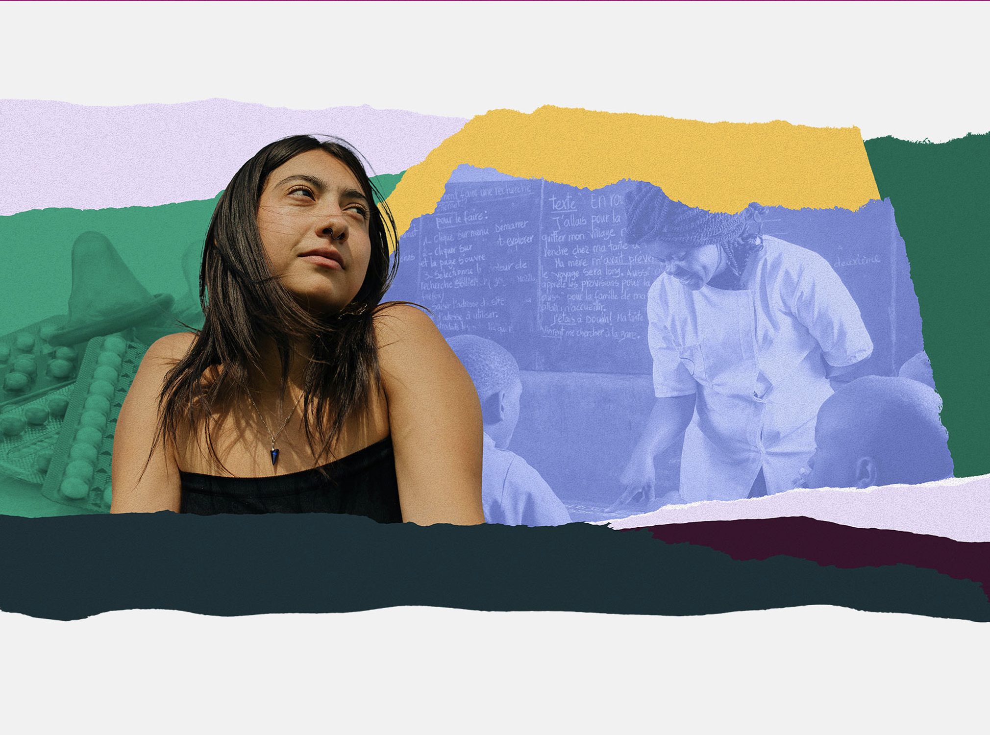
Custom Illustrations
Creative Problem:
The Center for Reproductive Rights held a powerful place in the global movement for bodily autonomy and women's rights, but their public-facing brand didn't reflect it. Cold, overtly legal, and intellectual, the brand felt more like an upper east side law firm than a movement fueled by passion and humanity. While the fight for reproductive rights worldwide was urgent and ongoing, their visual identity lacked the warmth, relevance, and human connection the cause demanded.
Creative Solution:
As part of a broader effort to reimagine their visual identity and website, I created a series of illustrated international portraits of women for their social media library and website—digital collages designed to bring humanity, diversity, and emotional resonance to the brand. The work was part of a larger transformation to make the organization feel more modern, connected, and true to the movement it leads. While many of these illustrations remained on the cutting room floor, there was power in this language of global portraiture (which was built upon for the final product) and the ability to create needed anonymity while evoking our shared humanity.
Role: As Creative Director and Illustrator, I conceived and created a series of digital portrait illustrations representing women internationally, contributing to the visual identity redesign and content library.
TRAILS
Creative Problem:
TRAILS — a nonprofit delivering evidence-based mental health programs to schools — needed a refreshed brand to match their expanding national footprint, but lacked a unified language to communicate authentically across three distinct audiences: the teachers, counselors, and school staff who implement their programs; the funders, policymakers, and public health officials who sustain them; and the youth and families at the heart of their work. Each audience needed something different from the brand, and without that clarity, TRAILS was starting from scratch every time they told their story.
Creative Solution:
I led a series of brand discovery workshops with TRAILS leadership and staff — designing exercises in audience perception, empathy mapping, tone of voice, brand archetypes, and values definition. Centering youth experience as the motivating lens, the sessions surfaced core brand themes and produced audience-specific insight maps, a draft brand narrative framework, and tonal guardrails — evolving what began as a web redesign into a full strategic and creative partnership delivering a refreshed brand identity, brand voice, original narrative, and a new youth-centric photo library.
Role: As Creative Director of Brand & Strategy at Wide Eye, I designed and facilitated the workshop series, synthesized staff and stakeholder input, and shaped the strategic creative foundation for TRAILS' evolving brand identity.
Design / Strategy Project Team:
Creative Direction, Brand Strategy, Copywriting: Elizabeth Bawol
Art Direction: Grace Abe
Design/Animation: Hyewon Lee
Digital Content Strategy: Lela Feldmeier
Photography by Rebecca Drois & Casting by Nancy Swenton
Produced: Brand System Design, Brand Narrative, Brand Tone of Voice, Content Strategy, Web Design, Brand Book, Collateral, Photo Shoot Casting and Creative Direction
Priorities, U.S.A.
Creative Problem:
In Democratic politics, Priorities USA had earned a strong reputation for building sustainable progressive infrastructure and an innovative, digital-first voter engagement machine. Yet, as one of the most powerful forces behind an informed and persuadable electorate, they had virtually no public facing brand. And, competition for donor attention is fierce—they needed more than their inside-the-beltway-reputation for audiences who needed them most.
Creative Solution: Our team developed a robust strategic process that produced engaging public-facing language, defined voice, and a bold, differentiated, modern, and digital-first brand identity. The new brand expression told a meaningful impact story to donors and inside-the-beltway influencers—positioning Priorities USA as the data-driven voter engagement machine it had become, with the American voter centered at the heart of the brand. The identity came to life through a dynamic website and a comprehensive brand book ensuring consistency and quality across all implementations.
Role: Creative Director of Brand Voice, Identity, Interactive.
Project Team:
Creative Director, Copywriter + Strategy Lead: Elizabeth Bawol
Senior Project Manager: Lola Jacobs
Associate Creative Director: Alayna Citrin
Senior Designer: Grace Abe
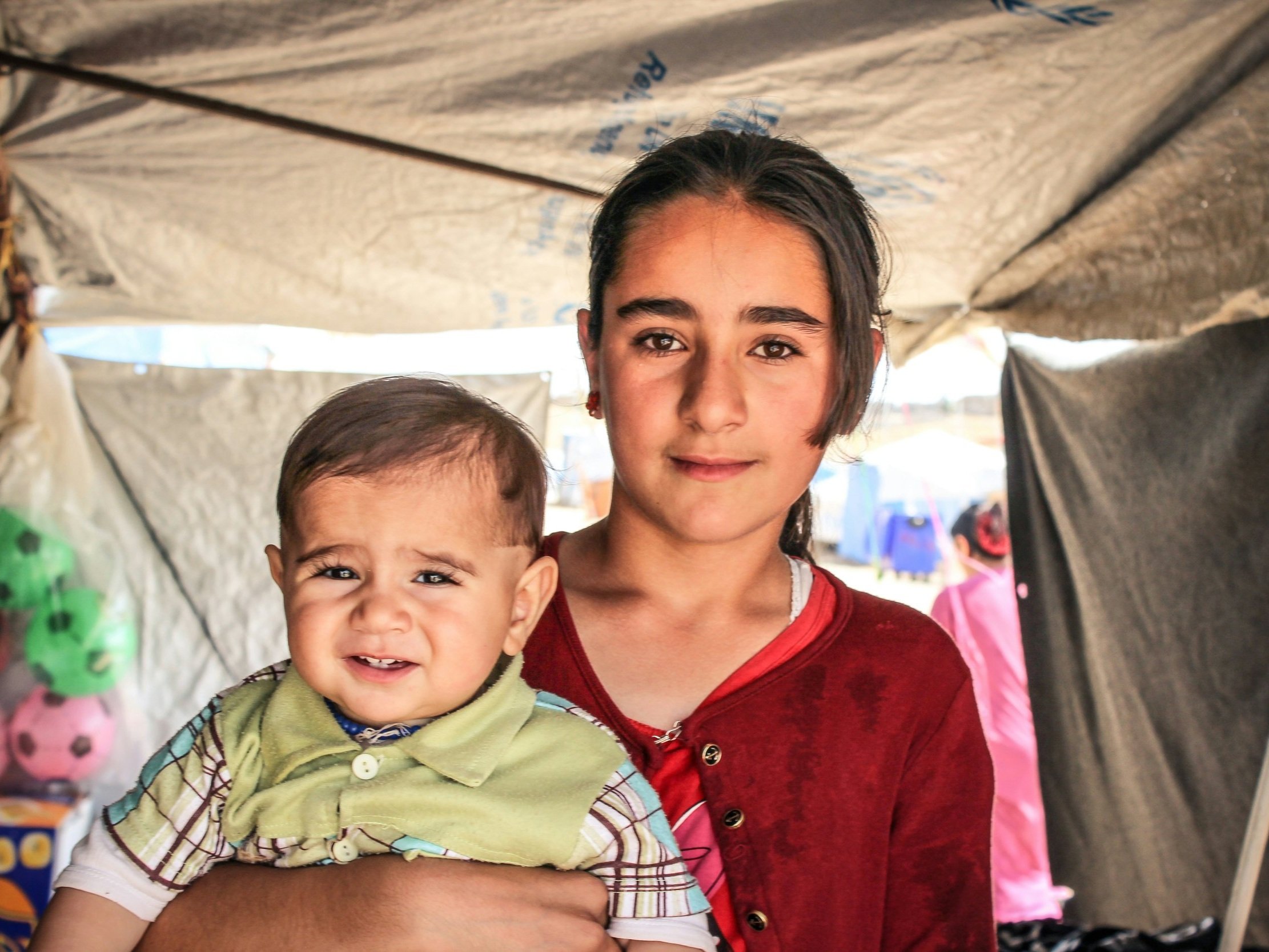
Refugees International
Project Team:
Creative Director/Strategist: Elizabeth Bawol
Assoc. Creative Director: Alayna Citrin
Art Director: Lizzie Willet
Designer: Samanta Moya Medina
Wide Eye Founder/ECD: Ben Ostrower
Primary Photo by Levi Meir Clancy
Bans Off
Creative Challenge:
As a dynamic and trusted brand for health care, and a defender of abortion access, Planned Parenthood needed to take a stand against the extreme abortion bans being introduced across the country.
When lawmakers enact bans on abortion—as they did at a breakneck speed in 2019— they harm real people. Abortion bans take away our ability to control our own bodies, our own health, and our own future. Bans Off My/Our Bodies began as a rallying cry for people across the country as those bans went into effect. The campaign was built to evolve to encompass a growing movement as more people became aware of the threat to our rights.
As attacks on abortion access, reproductive rights, and health care continued, and ultimately Roe was overturned as law, the campaign which originally appeared in advertisements, posters, rallies for the national reproductive rights’ organization, took on new meaning.
Creative Solution:
Bans Off My/Our Bodies originated in-house within the brand and culture team at Planned Parenthood as a body-positive campaign about the power of bodily autonomy and identity, but evolved to be something far greater. It became a national rallying cry that could be owned and evolved by creators, supporters, artists, and activists fighting for the reproductive rights’ movement across the country. Over years of impact, the campaign has become a crowd managed rallying cry and creative outlet for the reproductive rights movement and continued to evolve today.
Original Project Team:
Executive Creative Director: Elizabeth Bawol
Senior Brand Strategy: Lauren Garcimonde-Fisher
Senior Editorial Direction: Ylonda Gault
VP Brand & Culture: Rachel Moreno
SVP Communications: Melanie Newman
Be Seen
Creative Challenge:
As Planned Parenthood’s brand headquarters, we knew the organization had a legacy following and power recognition for quality health care and reproductive rights advocacy. However, prior to the fall of Roe, brand research underlined the need for greater familiarity among younger and diverse audiences who only knew about limited services we offered as a national health care chain providing a full range of reproductive health care for all genders, inclusive of contraceptive care, abortion, testing and treatment for sexually transmitted infections, cancer screenings, and routine health exams, LGBTQ+ gender affirming care, and much more.
Creative Solution:
In 2021, the brand and culture team launched a national brand campaign and conversation with a focus on resonance with Black and Latinx Gen Z audiences. We knew this was a generation that aligned with Planned Parenthood’s mission and values, and that they view identity more holistically and gender more fluidly. The organization’s legacy brand platform, “Care. No Matter Who / Where / What” overlapped with the views of a new generation that didn’t know the brand well. And, an opportunity emerged to both support young people in getting the compassionate, inclusive health care they need, and assert a shared view—that no one should be denied their freedom, bodily autonomy, or identity.
The Be Seen campaign was born to engage audiences around these shared values and introduce Planned Parenthood’s unique approach to health care, where patients could be seen for who they are holistically and without judgment.
Core messaging for the campaign included an inviting premise:
Planned Parenthood is here to see you — truly see you — become who you will be. We know that when you have full control over your decisions and your body, you can fight for what you're passionate about. Create the society you wish to see. Help your community. Or just live and be. Be Seen.
The campaign was multi-faceted and included audio spots, paid ads, merchandise, a robust influencer strategy and cross-channel social media engagement. The campaign also included partnerships with artists, influencers, and media outlets. An extension campaign emerged called “Tone,” a partnership with Refinery29/Unbothered, which produced a collection of culturally relevant meditations, visualizations, and words of self-care and wisdom during the pandemic, as both a wellness tool and affirmation effort. Engagement surpassed expectations and resulted in substantial brand favorability increase cross platforms, an 8.9% brand lift among black audiences, and over 15k organic engagements and 1.4M earned media impressions. The primary video spot achieved an award for #1 ad in the world for a week in 2021 by Ad Forum.
Project Team:
Executive Creative Director: Elizabeth Bawol
Senior Brand Strategist & Producer: Lauren Garcimonde-Fisher
Senior Editorial Direction: Ylonda Gault
VP Brand & Culture: Rachel Moreno
SVP Communications: Melanie Newman
Creative Partner: Virtue Worldwide
Ours to Tell (Film)
Creative Challenge:
Even prior to the fall of Roe in America, abortion access across the country was being subtly, but consistently attacked and access undermined. Over a decade, there had been an unprecedented number of state abortion restrictions introduced and passed. These restrictions disproportionately widen health care access gaps for people of color, and those with low incomes.
Planned Parenthood heard stories day after day from diverse women and people across the country who chose an abortion at some point in their lives. We asked 4 to tell us about their lives and their abortions to demonstrate that someone you know or love has had an abortion and each choice is a personal one.
Creative Solution:
“Ours to Tell” was a short film, created by Planned Parenthood, in partnership with We Testify, an organization that exists to destigmatize abortion in America. Directed by Academy Award winner, Rayka Zeytabchiand a diverse crew, the short film introduced an authentic perspective on the importance of access to safe, legal abortion.
The film launched on January 21, 2020 the day before the anniversary of Roe v. Wade and prior to the fall. The multi-channel activation occurred via live screenings, earned and paid media, organic and paid social, supporter engagement emails and SMS and included an influencer and brand campaign to promote it. A media launch at the Roxy Screening room occurred on the anniversary of the legislation, January 22.
The film defends the power of choice and access to safe, and legal abortion in this county and encourages understanding and compassion. 1 in 4 women choose to have an abortion in their lifetime and despite near constant political attacks and increased risk of further limitations, the vast majority of Americans from all political parties support access.
Overview: Without shame and without fear "Ours to Tell" is short film that depicts four people who share their abortion stories and walk in their truth. By owning the lives they choose what unfolds is an unfiltered and poetic demonstration of how the right to access abortion acts as a dynamic turning point in an individual's journey to freedom and self love. Each with different perspectives and experiences, the film's subjects — Brittany, Hannah, Nick and Ylonda — take us inside their worlds, their families, their souls and boldly illustrate the beauty and power of bodily autonomy. As we watch, listen and love each storyteller we also bear witness to a chilling reality: The fundamental freedom to own our body and future has never been more uncertain than it is today.
The film was accepted into over 35 film festivals and won a series of awards both nationally and internationally. Some of those include:
The Gold and Royal Gem Diamond Awards (Queen Palm International Film Festival)
Best Documentary Film of August 2020 from Direct Monthly Online Film Festival
Audience Choice Award for Best Documentary Short at the Women’s Film Festival San Diego
Best Short Documentary Film at the Chi-Town Multicultural Film Festival
Finalist at the Arizona Short Film Festival
Senior Creative Director and Executive Producer: Elizabeth Bawol
Co-Executive Producers: Lauren Garcimonde-Fisher, Ylonda Gault
Vice President of Brand + Culture: Rachel Moreno
See also full production credits in film.
We Decide
Creative Problem:
In 2020, reproductive rights weren't just under threat — they were on the ballot. With the outcome of the election poised to shape the future of bodily autonomy and intersectional rights for a generation, Planned Parenthood Votes needed a campaign that matched the urgency of the moment and moved supporters to action.
Creative Solution;
The "We Decide" campaign ran nationally, coming to life through live events, social content, and paid ads — rallying supporters by centering real people and tapping into the authentic emotions of the electorate. Bold, confident, and deeply representative of the country and its values, the campaign made clear that the power to determine the outcome belonged to the people.
Role: As Creative Director, I led the campaign concept, creative vision, and execution in partnership with Culture House — shaping a campaign that was as emotionally resonant as it was visually bold.
Creative Director: Elizabeth Bawol
Creative Partner: Culture House
Center for American Progress: Boldly Forward
Creative Challenge:
The Center for American Progress (CAP) is an independent, nonpartisan policy institute that is dedicated to improving the lives of all Americans through bold, progressive ideas, as well as strong leadership and concerted action. Their goal is to change the conversation, but to change the country.
Founded in 2003, CAP engaged the team at Wide Eye to name and brand their 20th Anniversary event— inclusive of an aligned strategy, future-forward name, and a powerful,
evolved visual identity. In designing an authentic strategy for this critical moment for their brand, it became apparent that there was a strong legacy and reputation, but a lack of alignment on what the brand represented, present and future.
Creative Solution:
We audited messaging, brand materials, and decades of progressive policy achievements and aligned on a central purpose for the organization in their Anniversary moment. Navigating stakeholders, staff, and executive leadership, our team drove a process of consensus among the many passionate advocates for American progress at a tumultuous and divisive time in United States’ politics and a transitional time for the organization itself.
We landed on the words of an inspiring new leader (2021) of the organization, Patrick Gaspard, for an articulation of the potential and possibility of the future of CAP and our country. He said,
“We move boldly forward in the face of challenges, with learnings under our belt, and expertise that has been hard-earned. We invite partners to move forward with us, and face what is ahead of our country, and without hesitation, in the true spirit of the Center for American Progress.”
This excerpt and unifying theme, “Boldly Forward” was paired with a bold and vibrant visual system that was on brand for CAP, but expanded their brand for a new era. The visual system integrated a bolder palette and layered in design elements that were easily scalable and unequivocally future-forward. The brand embodied the spirit of resilience and resolve that CAP was known for while inviting a new generation of partners to take part in their work towards American progress.
Project Team:
Creative Director, Copywriter + Strategy Lead: Elizabeth Bawol
Senior Project Manager + Strategist: Danielle Kantor
Art Directors: Victor Ware, Sharon Taylor
Senior Designer: Sebastian Arrendando
CEO + Founder, Wide Eye: Ben Ostrower
Health Resources in Action
Creative Challenge:
Health Resources in Action is a non-profit public health organization dedicated to addressing the intricate challenges surrounding access and equity within our health and social systems.
Despite extraordinary impact over more than six decades, the organization had yet to cultivate a distinct and purposeful identity rooted in their values. Their brand reputation among audiences was strong, but their visual identity included an outdated, generic logo, and no clear narrative about the extraordinary national impact they had.
Further, their visual identity had evolved into a network of brands, sub-brands, and programmatic identities that lacked order, consistency or deliberate connection.
Creative Solution:
Through months of strategic research and analysis, competitive differentiation, audience and architecture mapping, brand differentiation exercises, and collaborative workshops with the exceptional team at Health Resources in Action, we constructed a strategic foundation that set the stage for a strategic brand narrative, tone of voice guide, and visual identity. In order to fully capture the holistic way they solve some of society’s greatest health and wellness challenges and inequities.
The resulting central purpose (and, eventual tagline) Health Belongs to Everyone became an emotionally engaging way to clearly communicate the “why” behind their brand.
Project Team:
Brand Creative Director, Copywriter + Strategy Lead: Elizabeth Bawol
Senior Project Manager: Lola Jacobs
Associate Creative Director: Alayna Citrin
Senior Designer: Grace Abe
Designer: Sebastian Arredando
Designer / Animator: Hyewon Lee
Feature photo by Sai De Silva
Ready When You Are
Planned Parenthood’s national telehealth options were largely unknown to our patients across the country, and then Covid-19 changed the health care landscape and access to care dramatically. This national marketing effort, was created to raise awareness about our incredible virtual services and keep our patients as safe as possible. A national, integrated paid marketing campaign, “Ready When You Are” informed and simplified the telehealth process, underlined the important of sexual and reproductive healthcare and connected our patients with critical services. The concept ensured that our outreach didn’t lead with panic or urgency, which research has shown can be a barrier to patients seeking care, but instead acknowledged the patient’s self-awareness and need to seek care at their own pace and in their own way, as conveniently as possible.
PP Senior Creative Direction: Elizabeth Bawol
VP Brand & Culture: Rachel Moreno
Senior Brand Director: Lauren Garcimonde-Fisher
Partner Agency: Firebelly Design
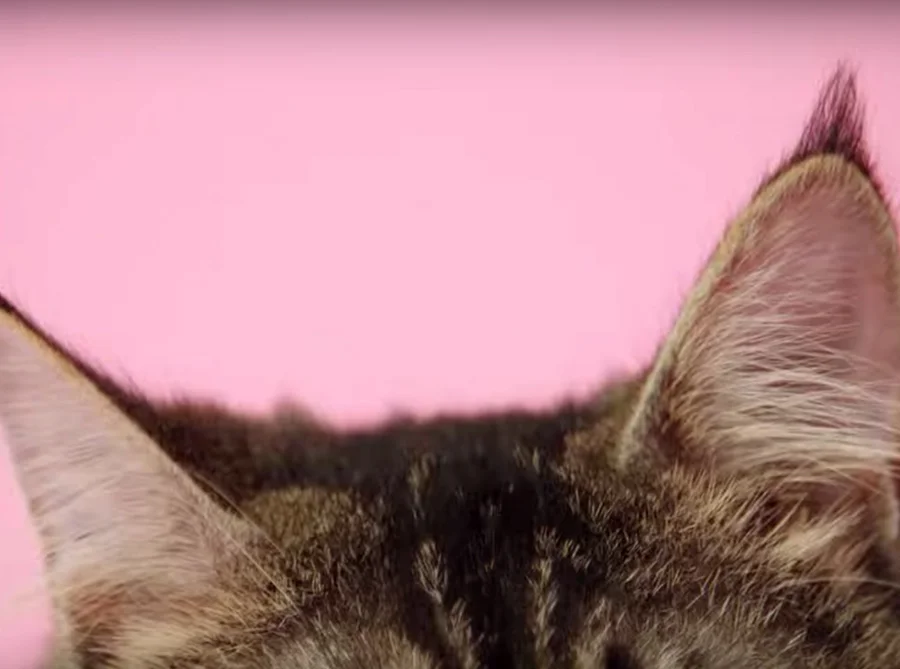
"Kitty" Videos
Creative Challenge:
Planned Parenthood is the largest provider of sexual health education in the country. Despite popular politicized myth, the goal of all education programs and products created by the educators at Planned Parenthood is to create a culturally relevant, evidence-based education that resonates with teens and young people in effective and empowering ways.
The trained professionals at Planned Parenthood help all people gain the information and skills they need to make the best decisions for themselves about sex and relationships.They reach 1.2 million people a year through education and outreach.
As such, the creative team at Planned Parenthood was often tasked with coming up with new and fun ways to engage audiences in information that can support the health of their bodies and minds. One such video series was dedicated to combating a viral stream of misinformation on popular influencer blogs about how you should care for your body.
Creative Solution:
We took the “awkward” subject and made it fun by using the slang reference of “kitties” and using real cats to communicate a thorough, accurate lesson on health care of the female body.
We used a popular social media trend at the time of "cats in rectangles" which was a phenomenon that gained traction in 2022, especially on platforms like Twitter and TikTok to make the videos fun and engaging. (It involved people sharing pictures or videos of cats (or other pets) inside small, confined rectangular spaces, often showing the cats in oddly shaped boxes, frames, or even between objects that made them look like they were inside a perfect rectangle.)
Our crew consisted of a traditional video production team and a team of cat wranglers to ensure all cat stars (19!) were fully cared for and pampered on set.
Creative Director and Executive Producer: Elizabeth Bawol
Senior Producer: Julie Zuckerbrod
Chief Brand Officer: Dawn Laguens
Production: Moore & Associates
Script-writing in consultation with Planned Parenthood digital health and education team
Community Change
A series of illustrations in the existing brand style of Community Change, a national organization that builds the power of low-income people, especially people of color, to create a multiracial democracy and a fair economy where everyone can thrive.
Creative Director (Wide Eye): Elizabeth Bawol
Creative Director (Community Change): Mikka Macdonald
Art Director: Sebastian Arrendondo
Senior Designer: Hyewon Lee
"Spot On" Period Tracker App
Creative Problem:
Period tracking apps had a representation problem—flooded with pink flowers, butterflies, and gendered assumptions about who menstruates, why, and with whom. Existing trackers made assumptions about gender, sexual orientation, and reproductive goals, leaving a huge swath of users without a product that spoke to them honestly or inclusively.
Creative Solution:
Spot On, Planned Parenthood's period and birth control tracker, was built to talk about periods and birth control the way real people do. The app supports tracking across every birth control method—pill, patch, ring, implant, shot, and IUD—while making zero assumptions about the user. Fun, playful, and completely nonjudgmental, the visual identity used intentionally selected colors and icons to ensure gender inclusivity and genuine engagement.
Role: As Creative Director, I partnered with the Director of Digital Products, to execute the creative vision for the app with our partner—shaping the inclusive, gender-neutral visual language, iconography, and tone that set Spot On apart from everything else on the market.
The original product was built and designed within Planned Parenthood's digital product lab with the support of Small Planet and BBMG, as well as the Planned Parenthood Creative Team.
Get Prepped
Creative Problem:
Planned Parenthood Federation of America needed a national campaign to raise awareness around PrEP and PEP — two medications that can dramatically reduce the risk of HIV transmission — at a moment when misinformation, stigma, and silence were still keeping people from accessing them. The campaign had to cut through shame-based messaging, reach both English and Spanish-speaking audiences, and feel genuinely inclusive and body positive rather than clinical or fear-driven.
Creative Solution:
"Sex Is Better When You're PrEPped" was a Federation-wide public health marketing campaign conceived and executed entirely in-house by the Planned Parenthood creative team. Deliberately sex positive, educational, and accessible, the campaign celebrated pleasure while centering harm reduction — reframing HIV prevention as an act of self-care rather than fear. Video production was supported by Cat Eye Pro, with photography by Kate Warren of Go Kate Shoot, all developed and directed by the in-house team.
My Role:
As Creative Director, I led the in-house team from concept through execution — shaping the campaign's voice, visual direction, and inclusive creative strategy across video, photography, and bilingual assets for both English and Spanish-speaking audiences nationwide.
© Planned Parenthood Federation of America 2019
Planned Parenthood team:
Senior Creative Director: Elizabeth Bawol
Associate Creative Director: Ande Hubbard
Senior Designer: Annie Pearlman
Writer: Holly Dunn
Brand Marketing Manager: Kyla Hsia
Digital Product Lead: Kevin Williams
Amnesty U.S.
Creative Challenge:
Before Amnesty International was associated as a brand with their famous yellow, they explored other bold palettes for attention and engagement. This is one of the earliest projects of my 20+ year career, but one I still remember dedicating months to and traveling to Portland, Oregon to see in real life.
The annual general meeting in (wait for it) 2006 was a musical experience as much as a rallying of members of Amnesty USA. Celebrities and musicians from all over came together for a member’s only concert and campaign to build community, establish and reinforce core values and build an advocacy force for the human rights of all people worldwide.
Creative Solution:
In deep partnership with the Amnesty team and creative collaborators around the globe, this campaign came to life by blending, collaging and juxtaposing military style imagery with music-making. “Human Rights at High Volume” was a celebration of the power of music, advocacy, and voice to change hearts and minds.
As part of a small team at a small agency in Baltimore we produced event materials, rally signs, flyers, posters, backdrops, stage graphics, stickers, banners, and digital promotion materials that numbers in the hundreds. We created an experience that I will never forget and a vibe that was felt and shared by over 500+ attendees.
Project Team:
Creative Director: Aaron Moore
Art Director / Designer: Elizabeth Bawol
Company: Orange Element Design, Baltimore, MD