
Senior Brand + Creative Director

Creative Problem:
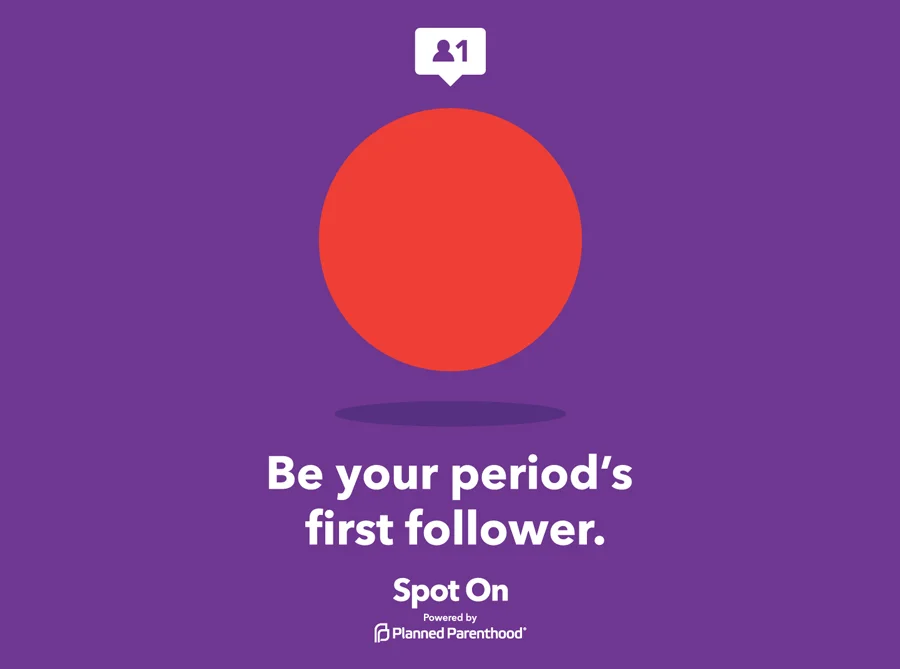
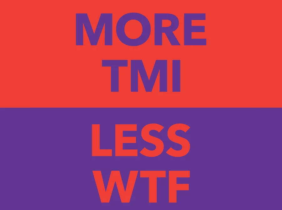
Period tracking apps had a representation problem—flooded with pink flowers, butterflies, and gendered assumptions about who menstruates, why, and with whom. Existing trackers made assumptions about gender, sexual orientation, and reproductive goals, leaving a huge swath of users without a product that spoke to them honestly or inclusively.
Creative Solution:
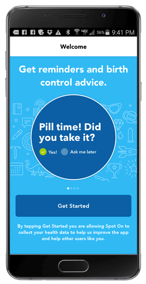
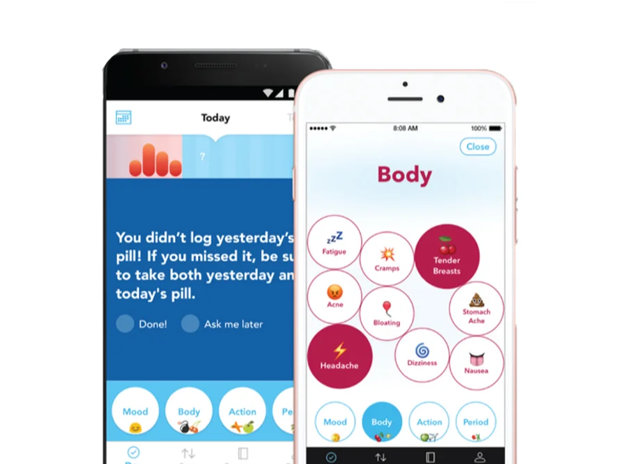
Spot On, Planned Parenthood's period and birth control tracker, was built to talk about periods and birth control the way real people do. The app supports tracking across every birth control method—pill, patch, ring, implant, shot, and IUD—while making zero assumptions about the user. Fun, playful, and completely nonjudgmental, the visual identity used intentionally selected colors and icons to ensure gender inclusivity and genuine engagement.
Role: As Creative Director, I partnered with the Director of Digital Products, to execute the creative vision for the app with our partner—shaping the inclusive, gender-neutral visual language, iconography, and tone that set Spot On apart from everything else on the market.
The original product was built and designed within Planned Parenthood's digital product lab with the support of Small Planet and BBMG, as well as the Planned Parenthood Creative Team.